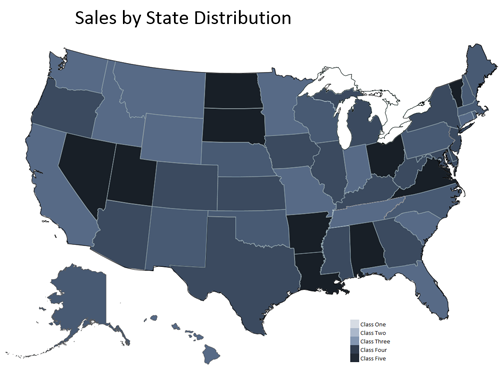
Visually Express Data with Excel in USA State Map
The world is visual and there are times that financial data needs to be presented in a visual form. Excel is capable of keeping up and making your life easier to display your data for management.
You can get the file Here
This excel model is an example that will allow you to enter data by state and see the distribution for each state. You could enter the percentage of sales gain for each state. Then change the colors to your favorite spectrum for the index. Add your labels for say each fifth of the distribution. Once you are done entering the values simply press the “redraw map” button on the map tab and boom! The map will be updated.
In Excel you can use VBA to change the color of any object.
Sub UpdateMap()

'

' Code to Update the Map

'
Range("actState").Value = Range("Master!A" & i).Value
ActiveSheet.Shapes(Range("actState").Value).Select
With Selection.ShapeRange.Fill
.Visible = msoTrue
.ForeColor.RGB = Range(Range("actStateCode").Value).Interior.Color
.ForeColor.TintAndShade = 0
.ForeColor.Brightness = -0.5
.Transparency = 0
.Solid
End With
End Sub
data, display, excel, financial model, heat map, map, visual